Responsive Navbar in HTML & CSS (Free Source Code)
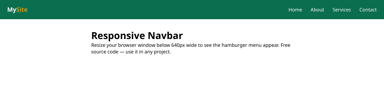
Every website needs a navigation bar, and building one from scratch is one of the best beginner projects you can tackle. A good navbar looks clean on a wide desktop screen but, just as importantly, collapses gracefully on a phone — instead of squishing your links into an unreadable mess, it tucks them behind the classic hamburger menu icon.
Below is a complete, copy-paste-ready responsive navbar. It lives in a single HTML file: the CSS sits in a <style> tag and a few lines of JavaScript handle the hamburger toggle. There are no frameworks, no dependencies, and no dropdown menus to complicate things — just a clean, simple navbar you can drop into any project and restyle in a few minutes. Paste it into a file, open it in your browser, and it works immediately.
<!DOCTYPE html>
<html lang="en">
<head>
<meta charset="UTF-8">
<meta name="viewport" content="width=device-width, initial-scale=1.0">
<title>Responsive Navbar</title>
<style>
  * { margin: 0; padding: 0; box-sizing: border-box; }
  body { font-family: Arial, Helvetica, sans-serif; }
  .navbar {
    display: flex;
    justify-content: space-between;
    align-items: center;
    background: #1f2937;
    padding: 0.8rem 1.5rem;
  }
  .logo { color: #fff; font-size: 1.4rem; font-weight: bold; text-decoration: none; }
  .nav-links { display: flex; list-style: none; gap: 1.5rem; }
  .nav-links a { color: #e5e7eb; text-decoration: none; font-size: 1rem; }
  .nav-links a:hover { color: #60a5fa; }
  .hamburger {
    display: none;
    flex-direction: column;
    cursor: pointer;
    background: none;
    border: none;
  }
  .hamburger span {
    width: 25px; height: 3px;
    background: #fff; margin: 3px 0;
    border-radius: 2px;
  }
  @media (max-width: 768px) {
    .hamburger { display: flex; }
    .nav-links {
      display: none;
      position: absolute;
      top: 58px; left: 0; right: 0;
      flex-direction: column;
      background: #1f2937;
      padding: 1rem;
      gap: 1rem;
    }
    .nav-links.active { display: flex; }
  }
</style>
</head>
<body>
<nav class="navbar">
  <a href="#" class="logo">MySite</a>
  <ul class="nav-links" id="navLinks">
    <li><a href="#">Home</a></li>
    <li><a href="#">About</a></li>
    <li><a href="#">Services</a></li>
    <li><a href="#">Contact</a></li>
  </ul>
  <button class="hamburger" id="hamburger" aria-label="Menu">
    <span></span><span></span><span></span>
  </button>
</nav>
<script>
  const hamburger = document.getElementById('hamburger');
  const navLinks = document.getElementById('navLinks');
  hamburger.addEventListener('click', () => {
    navLinks.classList.toggle('active');
  });
</script>
</body>
</html>
How it works
- Flexbox layout. The
.navbarusesdisplay: flexwithjustify-content: space-between, which automatically pushes the logo to the left and the links to the right on every screen size. - The hamburger is hidden on desktop. It has
display: noneby default and only appears inside the@media (max-width: 768px)query, which kicks in on tablets and phones. - The media query swaps the menu. Below 768px the link list is hidden and repositioned as a vertical panel; clicking the hamburger toggles the
.activeclass that shows it. - Tiny JavaScript toggle. Three lines of JavaScript listen for a click on the hamburger button and toggle the menu open or closed — no libraries needed.
- Easy to customize. Change the background in
.navbar, the link color in.nav-links a, the hover color, or swap the text logo for an image. Add more<li>links and the layout adapts.
Download the file
Prefer a ready-to-use file over copying from this page?
Download the complete navbar file
Save it anywhere, open it in your browser, and start customizing — no setup or build step required.
Recap
This responsive navbar gives you a professional navigation bar with a mobile hamburger menu in a single, dependency-free file. Copy the code above or grab the download, change the colors and links to match your site, and you are done.