Modern Login Form in HTML & CSS (Free Source Code)
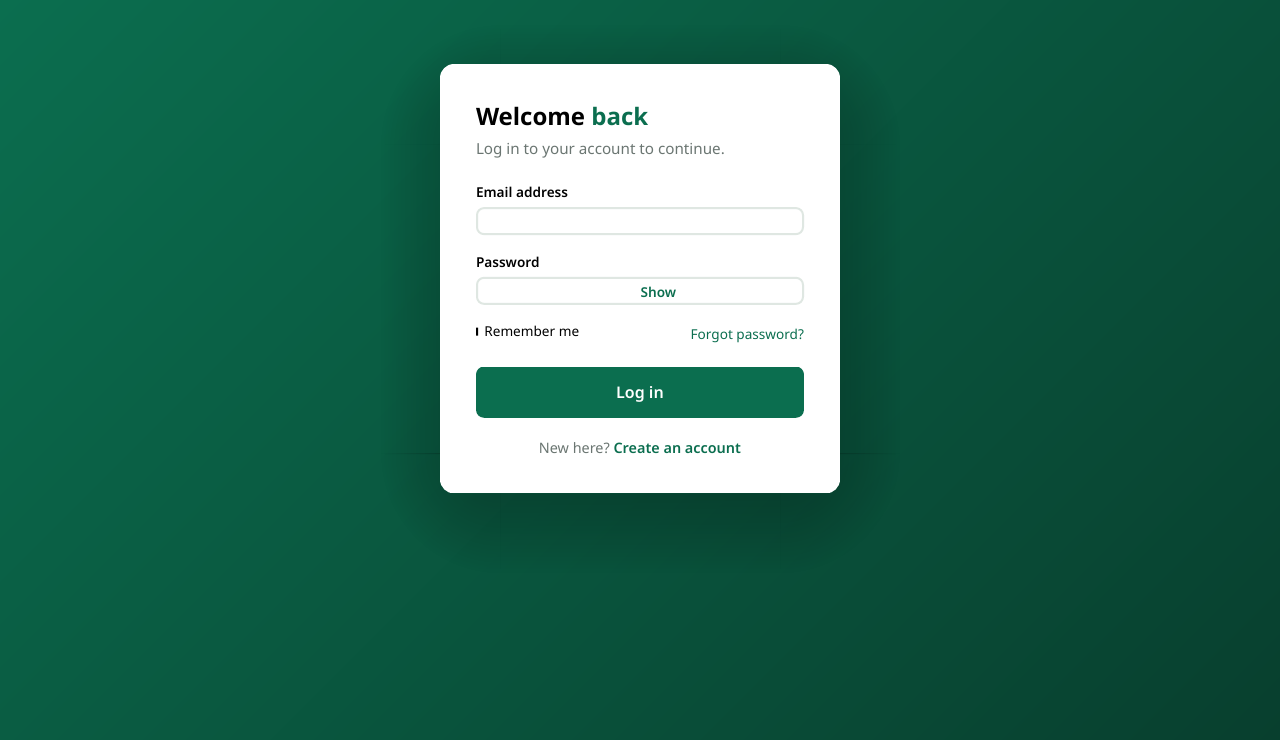
Almost every web project eventually needs a login page, and first impressions matter — a clean, modern form makes your whole site feel more trustworthy. This login form is a centered card on a soft gradient background, with email and password fields and a show/hide password toggle, which is a small touch users genuinely appreciate.
It is one self-contained HTML file: CSS in a <style> tag and a few lines of JavaScript for the password toggle. No frameworks and no dependencies. Note that this is a front-end demo — the form stops the default submit and shows a message, so you can wire it up to your own backend or authentication service when you are ready.
<!DOCTYPE html>
<html lang="en">
<head>
<meta charset="UTF-8">
<meta name="viewport" content="width=device-width, initial-scale=1.0">
<title>Login Form</title>
<style>
  * { margin: 0; padding: 0; box-sizing: border-box; }
  body {
    font-family: Arial, sans-serif;
    background: linear-gradient(135deg, #667eea, #764ba2);
    min-height: 100vh;
    display: flex; justify-content: center; align-items: center;
    padding: 1rem;
  }
  .card {
    background: #fff; width: 100%; max-width: 380px;
    border-radius: 14px; padding: 2rem;
    box-shadow: 0 8px 24px rgba(0,0,0,0.15);
  }
  h2 { text-align: center; margin-bottom: 1.5rem; color: #1f2937; }
  label { display: block; margin-bottom: 0.4rem; color: #374151; font-size: 0.9rem; }
  input[type="email"], input[type="password"], input[type="text"] {
    width: 100%; padding: 0.7rem; margin-bottom: 1rem;
    border: 1px solid #d1d5db; border-radius: 8px; font-size: 1rem;
  }
  .password-wrap { position: relative; }
  .toggle {
    position: absolute; right: 10px; top: 12px;
    background: none; border: none;
    color: #2563eb; cursor: pointer; font-size: 0.85rem;
  }
  button[type="submit"] {
    width: 100%; padding: 0.75rem;
    background: #2563eb; color: #fff;
    border: none; border-radius: 8px;
    font-size: 1rem; cursor: pointer;
  }
  button[type="submit"]:hover { background: #1d4ed8; }
  .link { text-align: center; margin-top: 1rem; font-size: 0.9rem; }
  .link a { color: #2563eb; text-decoration: none; }
</style>
</head>
<body>
<div class="card">
  <h2>Welcome Back</h2>
  <form id="loginForm">
    <label for="email">Email</label>
    <input type="email" id="email" placeholder="you@example.com" required>

    <label for="password">Password</label>
    <div class="password-wrap">
      <input type="password" id="password" placeholder="Enter your password" required>
      <button type="button" class="toggle" id="toggleBtn">Show</button>
    </div>

    <button type="submit">Log In</button>
  </form>
  <p class="link">Don't have an account? <a href="#">Sign up</a></p>
</div>
<script>
  const password = document.getElementById('password');
  const toggleBtn = document.getElementById('toggleBtn');

  toggleBtn.addEventListener('click', () => {
    const show = password.type === 'password';
    password.type = show ? 'text' : 'password';
    toggleBtn.textContent = show ? 'Hide' : 'Show';
  });

  document.getElementById('loginForm').addEventListener('submit', (e) => {
    e.preventDefault();
    alert('This is a demo form — connect it to your backend to log in for real.');
  });
</script>
</body>
</html>
How it works
- Centered card layout. Flexbox on the body centers the white card both horizontally and vertically, and the gradient background gives it a modern feel with one line of CSS.
- Semantic form fields. Real
<label>elements tied to each input withfor/idimprove accessibility, andtype="email"plusrequiredgive you free browser validation. - Show/hide password toggle. The toggle button sits inside a relatively-positioned wrapper and flips the input between
type="password"andtype="text", updating its own label between Show and Hide. - Submit is intercepted. The submit handler calls
preventDefault()so the page does not reload — the perfect hook point for adding your own login API call later. - Fully responsive.
max-width: 380pxwithwidth: 100%means the card looks right on phones and desktops alike.
Download the file
Grab it as a ready-made file:
Download the complete login form
Open it in your browser and connect the submit handler to your backend when you are ready to go live.
Recap
This login form gives you a polished, mobile-friendly sign-in card with a password visibility toggle in one dependency-free file. Copy the code above or download it, then wire the submit handler to your authentication backend.